Skins
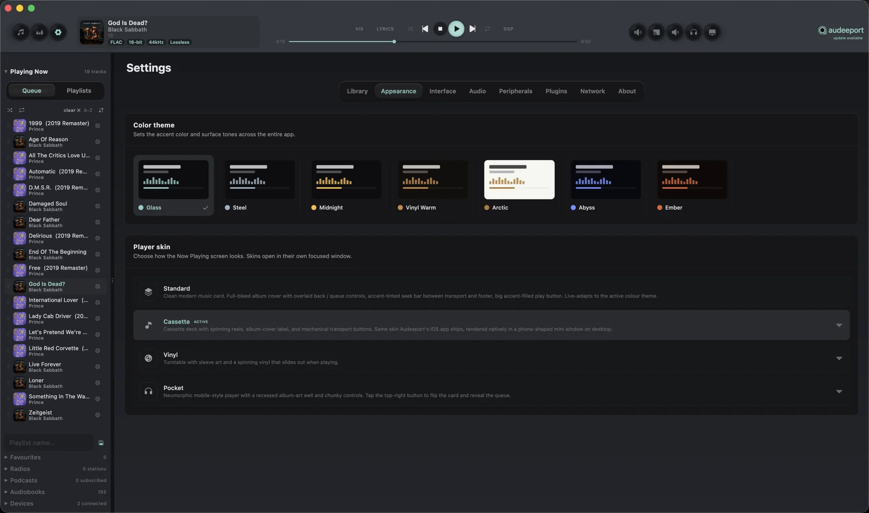
Audeeport ships with seven built-in colour themes and three view modes. You can build your own with the .deskin format. See the format reference once you’re past the basics here.
Built-in themes
| Theme | Character | Accent |
|---|---|---|
| Midnight | Default. Deep dark with signature gold | #F9B945 |
| Vinyl Warm | Warm dark, slightly amber | Warm rust |
| Arctic | Bright, near-white | Cool blue |
| Abyss | Pure black, high contrast | Cyan |
| Ember | Dark, warm orange highlights | Amber |
| Glass | Midnight’s dark palette with a soft teal accent | Teal |
| Steel | Midnight’s dark palette with a cool steel accent | Steel |
Switch themes from Settings > Appearance > Color theme. The change is instant. No restart.
View modes
Audeeport runs in one of three view modes at any given time:
Desktop
The default. Three resizable panels (playlist sidebar on the left, album browser in the centre, ID3 detail panel on the right) with draggable dividers and a transport bar at the bottom. Below 900 × 600, the layout collapses gracefully. Browse tabs become a dropdown, the ID3 panel auto-hides under 500 px wide.
Skin
A separate JavaFX window running an HTML/CSS/JS skin in a WebView. The skin draws the entire interface. Audeeport’s main window stays available behind it. Useful for compact playback windows, retro skins (think Winamp), or anything with custom transport widgets.
Mini
A 620 × 90 thin bar with transport, current track, and a small spectrum strip. Sits anywhere on screen. Useful when you’re working and don’t want a full player taking up real estate.
Switch between view modes with the picker in the player bar.
Player skins
Beyond the colour themes, Audeeport bundles a set of Now Playing player skins. Choose one from Settings > Appearance > Player skin. Each skin opens in its own focused window.
| Skin | What it is | Credit |
|---|---|---|
| Standard | Clean modern music card. Full-bleed album cover with overlaid back / queue controls, an accent-tinted seek bar, and a big accent-filled play button. Live-adapts to the active colour theme. | Audeeport |
| Cassette | Cassette deck with spinning reels, an album-cover label, and mechanical transport buttons. The same skin Audeeport’s iOS app ships, rendered natively in a phone-shaped mini window on desktop. | Audeeport |
| Vinyl | Turntable with sleeve art and a spinning vinyl that slides out when playing. | Mikkel Rask (CodePen) |
| Neumorphic mobile-style player with a recessed album-art well and chunky controls. Tap the top-right button to flip the card and reveal the queue. | Filip Legierski (CodePen) |
The Standard and Cassette skins are rendered natively; Vinyl and Pocket are web skins (HTML / CSS / JS) rendered in a JavaFX WebView.
Web skins (HTML / CSS / JS)
Community web skins are full HTML documents loaded in a JavaFX WebView. Audeeport injects a JavaScript bridge:
// Receive state pushes from the player
document.addEventListener('audeeport-state', (e) => {
  const { title, artist, album, albumArt, isPlaying,
          progressMs, durationMs, progress, volume,
          shuffle, repeat, queue, currentTrackId } = e.detail
  // update your UI
})

// Send transport commands back to the player
Audeeport.togglePlayPause()
Audeeport.next()
Audeeport.previous()
Audeeport.seek(fraction)      // 0.0 to 1.0
Audeeport.setVolume(fraction) // 0.0 to 1.0
The state event fires frequently during playback. Full bridge reference, including the audeeport-ready and audeeport-palette events, is in the .deskin format doc.
Skin gallery
Settings > Appearance > Player skin. A list of installed skins with author and source. Drop a .deskin file into ~/.audeeport/skins/ and it appears here on the next gallery refresh.
If a skin fails to load (corrupted package, malformed JSON, unreadable resource), Audeeport skips it and keeps the current skin. Your library and playback aren’t interrupted.
CoverFlow
Not technically a skin, but worth knowing about. Albums view > CoverFlow gives you a 3D perspective view of your album art that scrolls horizontally. Click an album to centre it. Useful for browsing visually rather than alphabetically. The S/M/L thumbnail toggle works in CoverFlow too.
Where to go next
- .deskin format reference. Package structure, JSON schema, asset requirements.
- Audio engine. For what’s behind the visuals.